Why McDonald’s “Fries as Phones” Ads Are a Masterclass in Modern Marketing
Sometimes, the right image says it all.
In a marketing landscape dominated by noise, speed, and ever-shortening attention spans, the most effective messages often come without a single word. McDonald’s recently delivered two brilliant examples of this with ads that land in under two seconds—no headline, no copy, just a visual punch that tells the whole story.

Let’s take a closer look at why these ads work so well, what lessons they offer, and how you can apply the same principles to your next campaign.
1. Visual Metaphor, Executed Perfectly
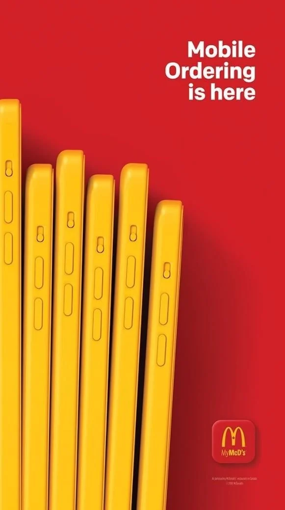
What did these ads show? Just smartphones shaped like McDonald’s fries. That’s it.
And yet, the message is unmistakable. Whether it's about mobile ordering, delivery, or simply the always-on accessibility of fast food, the visual does the heavy lifting. No pitch. No paragraph. Just one clever, relatable image.
✅ Takeaway: If your product is practical, make the imagery emotional.
Many brands struggle to make functional features feel exciting. This ad flips the script by turning a utilitarian message—fast food via mobile—into a relatable, even crave-worthy moment. The visual metaphor draws an instant connection between the everyday and the indulgent. It hits you emotionally, not logically.
2. Simplicity Over Noise
In a world where most ads are trying to do too much, this one does less—and wins because of it.
The composition is clean. The subject is focused. There’s no confusing call-to-action, no excess branding, no scattered storytelling. Just one visual, one idea, one impact.
✅ Takeaway: Don’t overcomplicate. The best ideas are sharp, not scattered.
When you try to say too much, you risk saying nothing at all. Simplicity isn’t a lack of creativity—it’s a refinement of it. The McDonald’s ads prove that the clearest message is often the most effective.
3. Right Place, Right Moment
A great ad isn’t just well-designed—it’s well-timed. These McDonald’s visuals were crafted for specific platforms, probably digital or social placements, where viewers scroll fast and judge faster. The creative team didn’t fight the format—they embraced it.
The visual lands instantly. It doesn’t beg for attention. It earns it.

✅ Takeaway: Great creative meets people exactly where they are.
Instead of trying to pull audiences out of their mindset, these ads step directly into it. That’s the secret to contextual relevance. Your campaign should reflect not just what people are doing, but how they’re doing it—what platform they’re on, what mood they’re in, what they need in that moment.
Respect Attention—Don’t Assume It
These McDonald’s ads are a perfect example of creative respect. They acknowledge that people are busy, distracted, and overwhelmed by content. They don’t assume your interest. They deserve it.
This mindset is something every marketer, designer, and brand strategist should embrace. Whether you're launching a product, planning a campaign, or simply posting to social media, the goal isn’t just to be seen—it’s to connect, instantly and memorably.
Final Thoughts: What This Means for Your Next Campaign
You don’t need a million-dollar budget to make a memorable impression. What you do need is:
A single strong idea. Don’t bury it—build around it.
An emotional hook. Even practical products should feel personal.
Simplicity with purpose. Clarity cuts through chaos.
Contextual awareness. Speak to the moment your audience is in.
The next time you build an ad, ask yourself: Can this land in under two seconds?
Because sometimes, the right image really does say it all.